TILLY'S ITALIAN BISCUITS CO.
For this project I looked at rebranding ‘Tilly’s Italian Biscuit Co.’ It requires graphics to promote the image of its premium range of Italian cookies; such as the biscotti, the florentine and the massirini.
TYPOGRAPHY
The design of this typography I have created is both modern and contemporary in style. I believe that the font should be as unique and clean as possible. Consumers will often only look at products for a short time and the aim of creating effective packaging is to get them to draw their eyes to the product, too understand as to what is inside and to remember it. Using a typeface that is so unique and only used in the Tilly’s Italian Biscuits Co brand will make them remember it and it will become more identifiable.

I have also used the Italian flag colour scheme to represent this typography. It almost appears that the flag is represented in each letter due to the 3 strokes within each letter. As most of this typography will be placed on a white background, I substituted the white lines for light grey ones to make them distinguishable.


POSTER DESIGN
The posters would be placed in areas very local to the shop. The poster is fairly minimalist, featuring my pattern design from previous experimentation, the logo type, description and the address. This gives the design a clean and modern feel and the centering of the design makes it visually appealing. I have also included illustrations of each biscuit within the pattern which are small details that are only picked up by the viewer once they are absorbed in the poster. They add an extra illustrated detail that in my opinion work well as another way to distinguish between the posters. The white space left means that there is space for other information and it also makes it easier to read.


BUSINESS CARD DESIGN
These are designs for business cards for ‘Tilly’s Italian Biscuits Co.’ The business card will be double sided, with the name on the front and the details (website, phone number, address) on the reverse. I have used the same colour swatches for continuity. The typical measurements for a business card are: 2”x3.5”.


WEBSITE DESIGN
As viewers hover over the different coloured triangles in the pattern, the relevant biscuit pops up. For example, when you hover over the green triangles, the biscotti instantly appears giving users a shortcut to that biscuit type.

MERCHANDISE/LABELS
This shoulder bag is merchandise for the brand ‘Tilly’s Italian Biscuits’. The biscuits are a premium brand so buyers are granted with this with the biscuits inside when they are checking out.


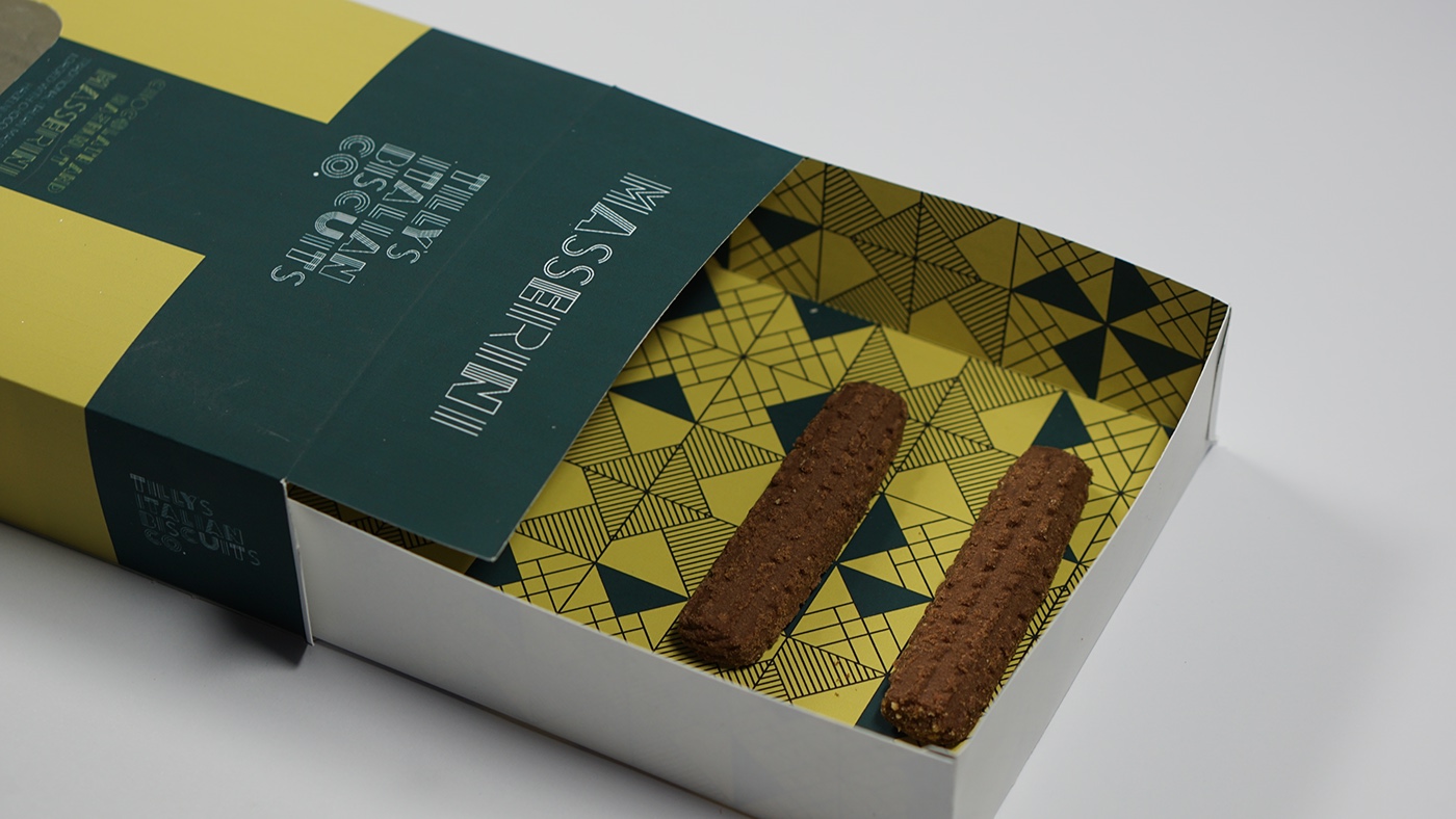
PACKAGING
The blocks of blue intersect one another forming a ‘T’ for ‘Tilly’s’. A window slot, located two thirds of the way down the packaging allows the biscuits to be visible. I wanted to also incorporate my pattern design into the packaging to maintain the overall consistency of the brand making it more identifiable in its advertising. However, I didn’t want to discard the simple use of blocks of colour to represent the packaging as I thought it would then be too clustered and would take away from the overall simplicity of the brand I was aiming to achieve. I therefore decided to add a sleeve within the packaging that were patterned using my design.